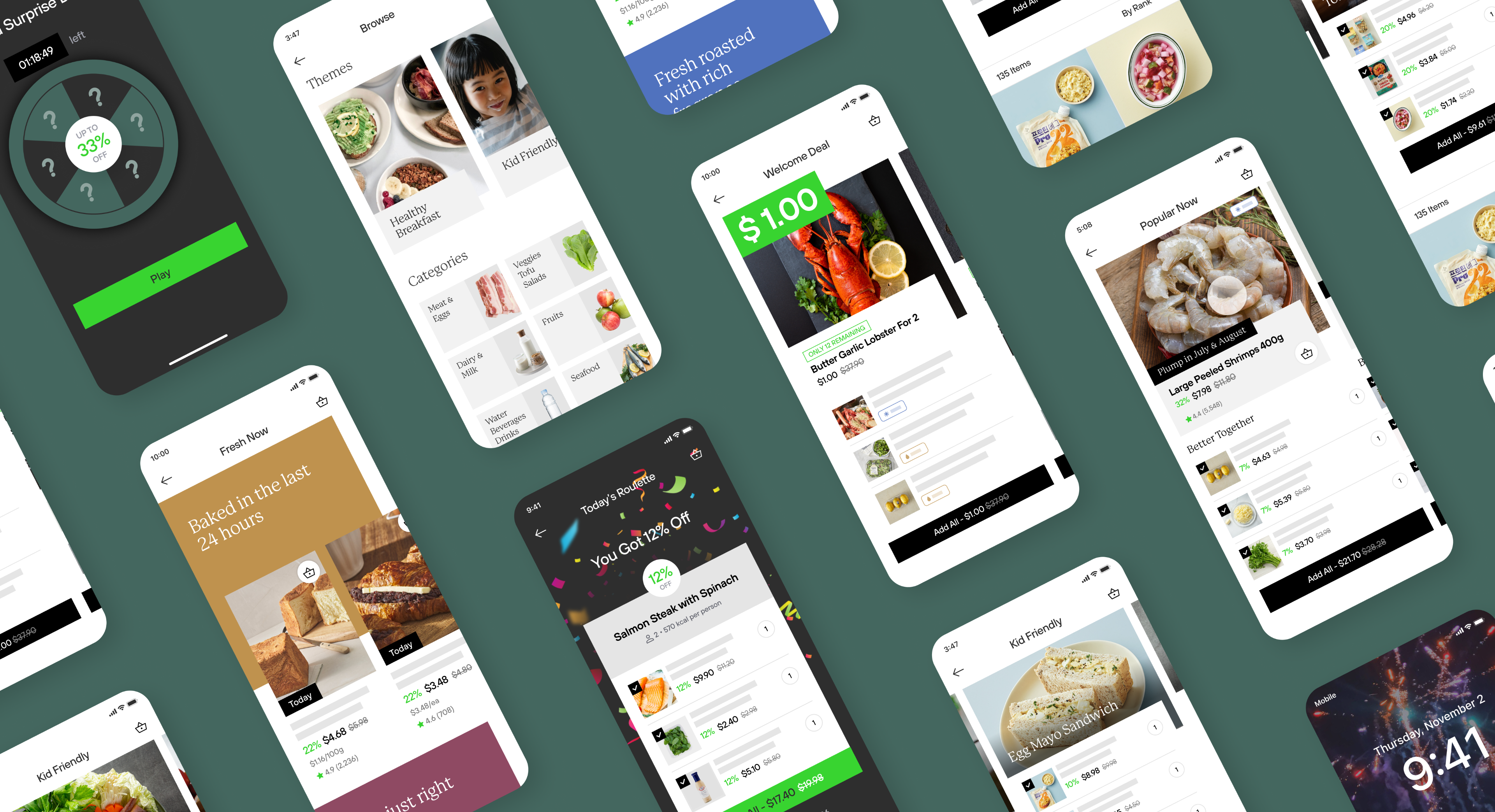
Fresh App (real name hidden) was a direct-to-consumer e-commerce brand by a large Korean company well known for their nationwide chain of convenience stores. They were late to enter the competitive online grocery space and struggled with customer retention and monetization, as the business relied on discount deals to attract customers in the absence of a clear value proposition and a lack of model-product fit.
I led the project on behalf of Daylight Design, a premium consultancy founded by ex-IDEO leadership. The original RFP was just for UX redesign. However, after discussing the client’s business objectives with their executives, we agreed to expand the scope to redefine the service from the ground up — i.e., new Product-Market Fit (PMF) narrative discovery, hypothesis testing, mobile app product design, and execution proposals.
Please note: Some images on this page have been re-created and re-styled with placeholder content to illustrate the work process and the output without disclosing the actual deliverables.
Diagnosis
Brand & Service Audit
Executive Interviews
Secondary Research
Conception
Customer Interview
Research Synthesis
New Service Concept
Validation
Value Prop Variants
Language-Market Fit Test
Purchase Flow Test
Growth Strategy
Core Habit Loop
Activation Features
Pricing Strategy
Product Design
Preliminary Brand Styles
Interactive Prototype
App Screens Design
Execution Guide
Inventory Strategy
Shipping Strategy
Content Guide
The Four Fits Framework is used to create & examine startup strategies. In order to build a scaleble business, we need to think about these four components, and how all of these pieces fit together.
My team focused on re-defining the product to address these two fits in particular:


We started by conducting customer interviews, chatting with the internal executives, visiting the warehouse, secondary research, as well as a CX audit of the current app.


As with any product strategy project, there were controversial, vague, and high-risk questions about what Fresh App 2.0 should be like.
These questions were grouped into themes, which were then mapped to 5-10 exaggerated app concepts.
We used the extreme versions of concept mockups during our customer interviews to facilitate customer reactions and accelerate our learning.


Qualitative research findings indicated the main customer problem to solve is deciding what to eat for the upcoming meals in the next 24 hours, and suggesting products that will act as components of those menus.
That meant our inventory had to be overhauled to support the menu-based use cases based on the time of the day.


We conducted an audit of the overall product categories and major product search terms to identify a set of guidelines for overhauling the product inventory. This new inventory strategy became the foundational premise to the rest of the product fit hypothesis.


After identifying an overall direction for the new product, we ran broad validation sprints to de-risk the concept direction and learn more about target customer’s preferences on the major variables.
In order to test multiple variables at once, I devised an approach to methodically encode our assumptions into App Store design mockups and then decode them so that we can analyze the responses both qualitatively and quantitatively from a survey of 250 participants.


New product strategy often leads to difficulty in getting users establish a habit around the new value proposition — a foundational requirement for retention and growth.
To help users establish a new habit loop, we arrived at the following activation trategies:


The friction level of the monetization model needs to match how the value prop is experienced by the customer.
In order to lower the pricing friction and increase the Model-Product Fit, we devised a pricing scheme to offer small discounts (3% or more) when you buy any of the items listed in the menu-based bundles.


A preliminary set of visual and UX styles were developed to convey the curated bundle-based value prop and “fresh” brand fit.


